A standard tax return answers one question: what do you owe this year? A tax map answers something harder: what does additional income actually cost you – after taxes, Medicare premiums, ACA subsidies, and every other variable that shifts when your income does?
The distinction matters enormously for tax planning. For example a $10,000 Roth conversion can look straightforward in a tax bracket table and catastrophic in practice if it wipes out an ACA subsidy. Seeing that cliff before you cross it is exactly what tax maps are designed for.
Princeton Asset’s Income Tax Calculator builds on the tax mapping concepts popularized by retirement researcher Wade Pfau, letting you create interactive charts that trace real after-tax outcomes across dozens of income scenarios – not just federal brackets, but IRMAA surcharges, Social Security taxation, capital gains interactions, state taxes, and total disposable income.
Tax returns explain the past. Tax maps help you plan the future.
What Is a Tax Map?
A tax map is a scenario-based chart that shows how tax outcomes change as tax inputs change. Instead of looking at a single tax estimate, you can trace relevant tax metrics across a sequence of tax scenarios.
The point is to measure the real cost of additional income configurations, not just the federal tax bracket changes. That perspective becomes especially useful as Social Security, capital gains, Medicare premiums, ACA rules, and state taxes all interact.
Why Tax Maps Help with Financial Planning
Traditional tax planning often isolates one tax return at a time. In a tax map multiple dimensions can be displayed simultaneously across many tax scenarios. This makes it possible to see interactions that are difficult to identify when looking at a single tax estimate.
For example:
- Disposable income growing slower than gross income due to tax cliffs.
- IRA withdrawals increasing taxable Social Security.
- Additional income triggering IRMAA surcharges.
- Capital gains causing NII tax exposure.
Tax maps make those relationships visible across multiple scenarios, so you can see where income is taxed lightly, heavily, or unexpectedly. For retirees and near-retirees, that can change how they think about withdrawals, Roth conversions, capital gains realization, and which accounts should fund spending first.
In other words, a tax map helps reveal the hidden cross scenario costs variabilities that are often invisible when looking at a single tax estimate.
What Princeton Asset’s Calculator Shows
Princeton Asset’s income tax calculator automatically computes a wide set of outputs for each tax scenario, including:
- Federal marginal tax bracket.
- Federal capital gains marginal tax bracket.
- Federal NII marginal tax bracket.
- State marginal tax bracket.
- Federal income tax.
- Federal capital gains tax.
- Federal NII tax.
- State income tax.
- FICA tax.
- Self-employment tax deduction.
- Taxable Social Security amount.
- ACA MAGI.
- ACA health insurance.
- IRMAA MAGI.
- IRMAA.
- Gross income.
- Net income.
- Total tax.
- Effective tax rate.
- Blended marginal tax rate.
- Effective marginal tax rate
- Healthcare premium.
- Disposable income.
- Disposable income percentage.
- Principal.
- Total available funds.
This is helpful because a change in the retirement income structure is rarely just a tax decision. A withdrawal from a retirement account can raise ordinary income, increase taxable Social Security, affect healthcare costs, and push the household into a different effective marginal rate than expected.
BMR vs. EMR
Two of the most useful output dimensions are Blended Marginal Tax Rate (BMR) and Effective Marginal Rate (EMR).
BMR measures the tax ratio applied to additional income. In practical terms, it helps answer: “If I add additional income, at what effective tax rate will it be taxed?”.
EMR uses the same additional income sources from BMR settings, but includes the related healthcare costs. That makes it better suited for retirement-income comparisons, especially when Medicare premiums, IRMAA, or ACA costs are part of the decision.
The calculator also includes a BMR to 1st Point and EMR to 1st Point values accessible from the chart settings. They allows users to compute BMR and EMR relative to the first point (tax scenario) in a tax map, which is especially helpful when comparing multiple scenarios side by side or when comparing against a baseline.
How the Charting Feature Works
The chart is built for cross-scenario analysis. You can add the current tax scenarios to the chart by clicking the plus button [+] in the chart toolbar, then you can choose which dimensions you want to trace in the tax map across tax scenarios by clicking on the chart settings icon and selecting those dimensions.
That lets you visualize nearly any output dimension over a range of different inputs. Instead of relying on a static estimate, you can compare how tax, healthcare, cashflow outputs and ratios change across different tax scenarios.
Each point in the trace can be moved left or right, deleted, or labeled. In addition, when you double click a point on the chart, that scenario loads back into the calculator and the outputs are recomputed automatically. That creates a closed loop between charting and planning, making the tool more interactive and more useful for real decision-making.
Why Tax Maps are More Useful Than Simple Tax Snapshot Views
Most tax tools are designed to show a single tax estimate or return snapshot. Princeton Asset’s tax maps are designed to show how those tax outputs change for each tax scenario.
Retirement planning is full of thresholds and cliffs, including:
- Taxable Social Security changes.
- IRMAA surcharge thresholds.
- Income related loss of ACA subsidies.
- Capital gains and qualified dividend interactions.
- State tax effects that may not match federal treatment.
- Changes in the tax cost of each additional dollar of income.
Tax maps make those shifts visible in a single chart. They help reveal the plateaus, step-ups, and hidden cliffs that can make a withdrawal strategy or Roth conversion look very different from one marginal dollar to the next.
Example Tax Map Scenarios
One of the best ways to teach tax maps is with saved scenario examples. A few well-chosen examples can show how the same calculator behaves under different income patterns.
Below we provided links to a few example we thought to be relevant:
Example 1: A married filing jointly (MFJ) couple from NY with 2 kids that have 115K in W2 income and 10K in dividends want to evaluate a switch to 154K on 1099 to work as independent contractors and 10K in dividends.
| Scenario => Output Variable ↓ | Scenario 1 ($115K on W2 +10K div) | Scenario 2 (154K on 1099 + 10K div) |
|---|---|---|
| Gross Income | $125,000.00 | $164,000.00 |
| Total Tax | $19,652.25 | $40,590.71 |
| Healthcare Premium | $12,000.00 | $30,000.00 |
| Disposable Income | $93,347.75 | $93,409.29 |
| BMR to 1st Point | 0.00% | 53.69% |
| EMR to 1st Point | 0.00% | 99.84% |
Even though the Gross Income increases by $39K the Effective Marginal Rate – EMR to 1st Point reveals that most of the extra income (99.64%) will go toward extra taxes and healthcare premiums. Leading to a Disposable Income difference of just $61.54 with taxes consuming 53.69% of the extra Gross Income as showed by the Blended Marginal Rate – BMR to 1st Point. Effectively a wash.
Example 2: Early retired couple (MFJ) from NJ with 2 kids. Baseline income:\ $60K in long term capital gains, $15K in non-qualified dividends and $45K in qualified dividends. We will evaluate the Effective Tax Rate on Roth conversions starting with $10K increments.
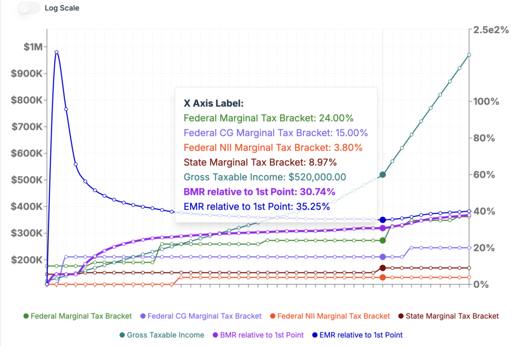
Surprisingly the lowest EMR relative to baseline is 35.25%. This ratio is for a IRA to Roth conversion of $400K. It means that 35.25% of the additional $400K of income will go to taxes and healthcare costs (*). This minimum EMR point took place at an income level close to the end of the 24% federal tax bracket. If the couple converts less than $400K the healthcare costs will push the ratio higher; the 400% Federal Poverty Level at which ACA subsidies are terminated is $128,600.00. Just and additional $10K from baseline is pushing the EMR to 186%. If they want to convert more than $400K the EMR will increase due to increases in the federal tax brackets.
The baseline case:
– Effective Tax Rate 2.98% all comprised of NJ state income tax as their federal tax is zero
– Blended Marginal Tax Rate 5.52% for one $ of additional income.
– Effective Marginal Rate (EMR) 15.48% for one $ of additional income.
(*) – In our simulation we assume tax and healthcare expenses will be paid with cash from taxable account.
This leads us to:
Example 3: Same early retired couple from Example 2 above but with a lower baseline income: $15K in non-qualified dividends and $45K in qualified dividends. We evaluate the Effective Tax Rate on Roth conversions in $10K increments.
Baseline effective cost rate (total_tax+healthcare)/Gross_Taxable_Income is 7.55%. But the EMR on the first 10K of Roth conversion is 17.49%.
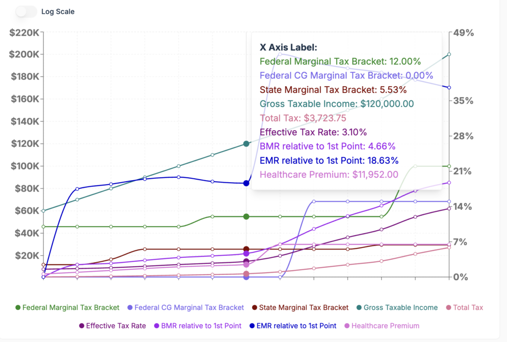
For reference a 17.5% effective tax rate, the rate at which they can do the cheapest Roth conversion, would require an RMD in todays money of $216K for a couple filing a joint return.
We hope that these examples will help readers see the calculator in action and make the concept of tax maps feel more concrete.
A Better Planning Conversation
The real value of this feature is that it helps households and advisors ask better tax planning questions. Instead of focusing only on “What is my tax rate?” the conversation becomes: “What is the total cost of this income decision after taxes, healthcare costs, and benefit interactions?”
That is where tax maps shine. They help turn tax planning into a more complete decision framework, especially in retirement when small income changes can create outsized downstream effects.
Princeton Asset’s income tax calculator gives users a better way to plan taxes and all-in related costs. By mapping how tax inputs flow through multiple output dimensions, it helps reveal not just what is owed, but measure the “real cost” of additional income after all the moving parts are included.
Most tax software tells you what you owe. A tax map tells you what a decision costs. In retirement, that difference can be worth tens of thousands of dollars.
Disclaimer: This blog post is for informational purposes only and should not be considered financial advice. Past performance is not a guarantee of future results. Consult with a qualified financial advisor for personalized guidance.
Leave a Reply